Last Updated on August 31, 2023 by David
Losing individuality for a greater purpose.
Here are some interesting images.
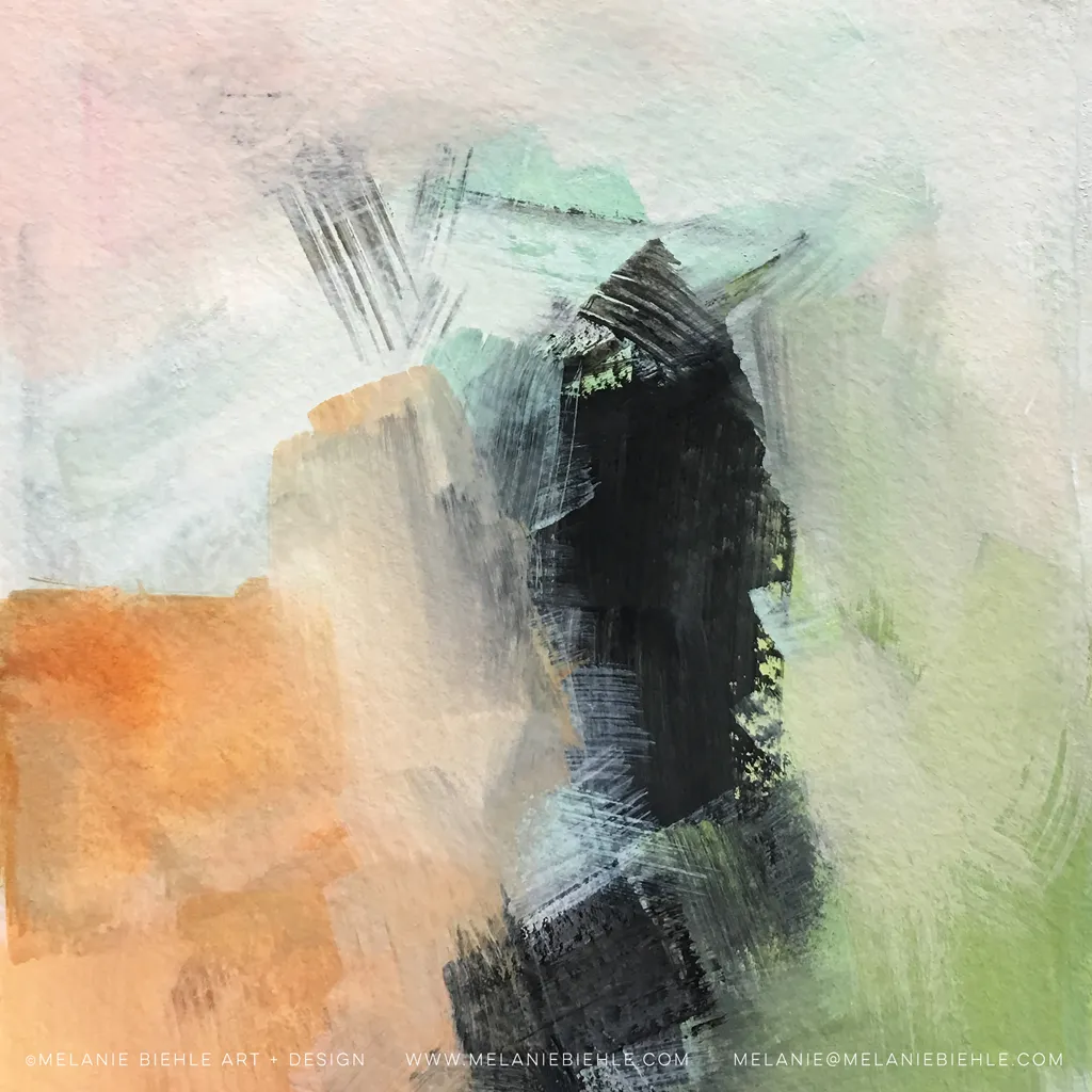
Looking closer, you’ll notice that there’s not a single (or very few) true primary color. But we all know primary colors are actually what composes the actual colors we see in all images. What’s so interesting is that the creators of these images have consciously chosen a palette that steers away from the primaries we’re so used to.

So what’s the lesson here?
There’s a parallel in music that these images reminded us of — keys and scales. When a composer wants to “avoid primaries” they’ll consciously navigate to uncommon chord progressions. So the question is, is it better to stick with strong primary “colors” or try to present things in more uncommon palettes? Of course, this leads to a discourse in product design.
If your product has 3 functions: A, B, and C, should you just have 3 clearly defined buttons that do A, B, and C? Or should you “palettize” those functionalities into a combined feature set? What are the pros and cons?

Take the awesome VoiceTone by MicMechanic for example. This little device does 10–20 different things. But there are just 4 buttons or interactive features. This design is clearly designed to palettize away the primary functions of its intended use. In other words, these individual features are intentionally abstracted away in order to work in unison.

Here’s a different product that sticks to primary colors even though the functions can’t be palettized together like the VoiceTone. Each individual key cannot be combined with another key to do a combination of things but the colors establish a clear break between functions.
The central theme here is one of “composition”. In all things, there are bare bone atoms, or individual “features”, and these bare bone atoms make up combined “feature-sets”. Avoiding “primaries” or individual “features” can be a great challenge for all types of content and product creators. How much you want to expose those individual features vs a packaged feature-set therefore, is a matter of product design and intent.
At Reamaze, we do a few things: conversations, channel consolidation, chat/messaging, roles/permissions, reporting, KB, etc, and in each case,
we could have completely separated out these individual features to the extreme of having them be completely different products.
Reamaze Chat could a separate product from Reamaze social integrations, for example, which could be separate from Reamaze KB. Instead, we’ve chosen a particular palette in our product based on those “primary colors” that combines them to a format we think businesses can best utilize.
There are trade offs and sacrifices — exposing the primary colors directly is more understandable — a customer most certainly understands the difference between a KB product and a Live Chat product. But we’ve taken a risk in consolidating a ton of features into a palette. That means we have to bear the task of helping customers get comfortable with our palette just as a great composer must be more creative when working with non-popular chord progressions. The result is nonetheless more unique and satisfying — at least that’s what we hope to achieve as platform builders and product designers.